5 POPULAR KITCHEN COLOUR SCHEMES
A kitchen remodel is always a lot of effort and stress and that’s before you’ve even got to choosing out your colour scheme. You’ve got all of your units, accessories, flooring and surfaces but now it’s time to pick out the perfect colours. This is an important decision because you’ll have to live with that it for a good few years. Ridgeway provides kitchens in Oxford and would like to help you.
After all, colour is a very powerful design tool and it can affect the entire mood of your kitchen life. It has the incredible ability to change your perception of space, warmth and brightness while expressing your very own personality.
So, without further ado, let’s get into our five inspirational colour schemes to get your creative juices flowing…
COASTAL COLOUR SCHEME
If you want to create something fresh and breezy, a coastal colour palette could be perfect for your kitchen with a mix of gentle blues, off-whites and greys. This colour scheme is very versatile and can be used in any combination your desire. We suggest that you build up your colours in layers and you can step things up a bit by using multiple shades of the same colour with varying textures to create a clean colour scheme that is warm and inviting.
ADD COLOUR IN UNEXPECTED PLACES
Don’t be afraid to explore use of pattern in more places than just your walls. Injecting colour into unexpected places like your flooring can be a fun way to add personality into your kitchen. The above photo features a geometric design that gives off an air of sophistication while being fun. It is somewhat nostalgic in its use of industrial design and works perfectly with the ceramic tiles and dark units.
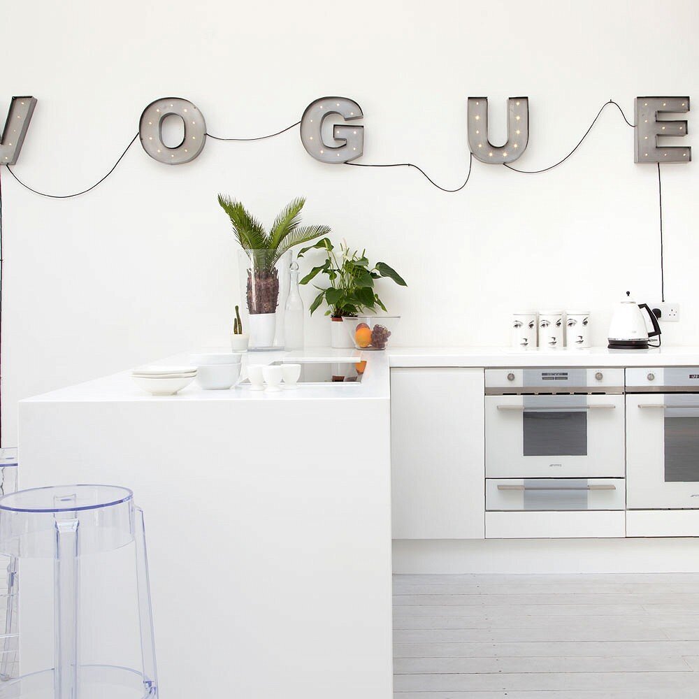
CLASSIC WHITE
There’s a reason why a style becomes classic and sticks around— they are brilliant (white). You should think about embracing a minimalist colour palette and design that features glossy white paint and some design-led details that provide glam touches in your kitchen. To add some depth to your room, you could add textured white tiles to your splashback and white gloss units that blend seamlessly into your walls. For the full effect, you can go as far as co-ordinating your appliances to be white too.
CONTRAST COLOURS FOR IMPACT
Contrasting colours is a very modern technique and it is easy to achieve this bold styling. Using white as an accent colour and a shiny high-gloss unit in a vibrant primary colour can help create the wow factor in your kitchen. The primary colour creates a bold statement and the white makes it feel light and spacious. You can even go one step further and add a hint of colour to your flooring with striped vinyl flooring which can add to the feeling of extra space.
VINTAGE FLORAL PASTEL VIBES
Spring is often the best time of year, it’s the sign of a new beginning and when most of us will have a good tidy around our home. So, why not maintain that feeling all year round with a colour scheme that is bursting with colour. This can be achieved with a bold vintage look that takes advantage of oversized floral patterns and pastel colour palettes. However, you should keep these patterns to your walls and keep the rest white to keep the fresh colour palette alive.


